Design
Overview
This project aimed to create a scalable, versatile UI Kit to streamline product development and enhance design consistency across applications. The focus was on delivering customizable components to cater to various use cases, employing atomic design principles to balance flexibility and efficiency.
Challenge
The existing design process was inefficient, leading to inconsistent user interfaces across products and platforms. Teams struggled with a lack of reusable components, which increased development time and resource utilization as the solutions available could not accommodate diverse use cases without extensive modifications. The absence of a scalable, structured design system hindered collaboration, rapid iteration, led to resource-intensive customization processes and resulted in disjointed user experiences, delaying development timelines and compromising design quality.
Approach
Research
Component Analysis:
Performed an audit of existing UI libraries to identify recurring pain points, including poor scalability and limited customization options. This analysis provided a foundation for creating a more adaptable and modular design system.
User Feedback:
Engaged with product teams and developers through interviews to gather requirements for a flexible and easy-to-use UI kit. Insights emphasized the need for efficiency, accessibility, and customization.
Accessibility Standards:
Referenced WCAG guidelines to ensure all components adhered to inclusivity standards, supporting users with diverse needs and abilities.
Atomic Design Methodology
Adopted a structured, scalable approach to building the UI kit:
Atoms: Developed fundamental elements like buttons, typography, and input fields, serving as the building blocks of the design system.
Molecules: Combined atoms into functional units such as form fields and modals, enhancing usability.
Organisms: Created complex components by integrating molecules, including dashboards and navigation menus, for seamless functionality.
Templates: Designed layouts with placeholders to accommodate dynamic content, ensuring consistency and adaptability.
Pages: Applied templates and components to demonstrate real-world use cases, validating design versatility.
Prototyping and Testing
Iterative Prototyping:
Followed an iterative process to create and refine individual components, ensuring alignment with project goals and user needs.
Usability Testing:
Collaborated with developers and designers to test prototypes for ease of implementation, scalability, and user experience. Feedback loops were established to incorporate improvements efficiently.
By integrating user insights, adhering to accessibility guidelines, and applying atomic design principles, the resulting UI kit ensures consistency, flexibility, and efficiency across platforms while maintaining a strong focus on usability and scalability.
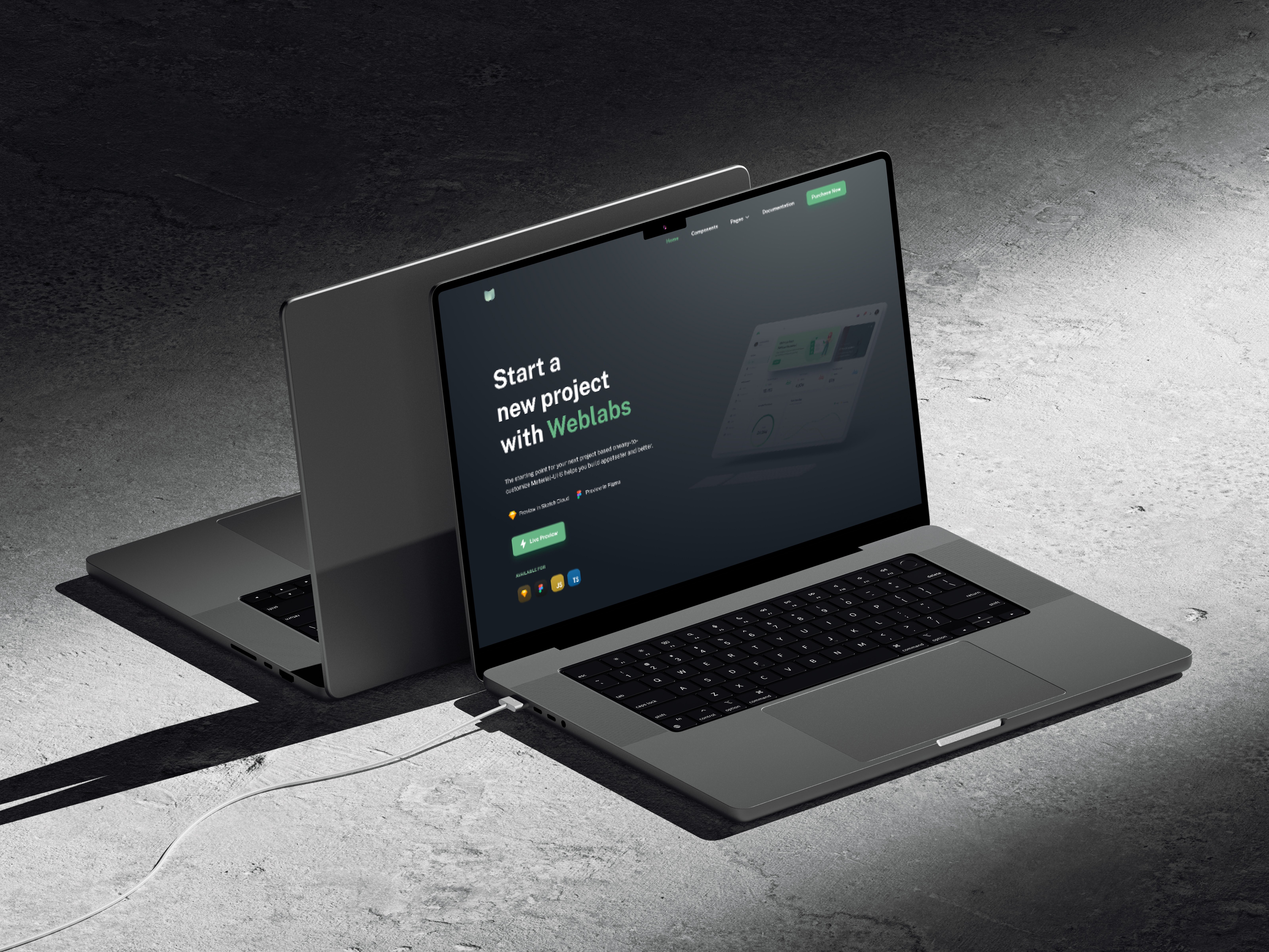
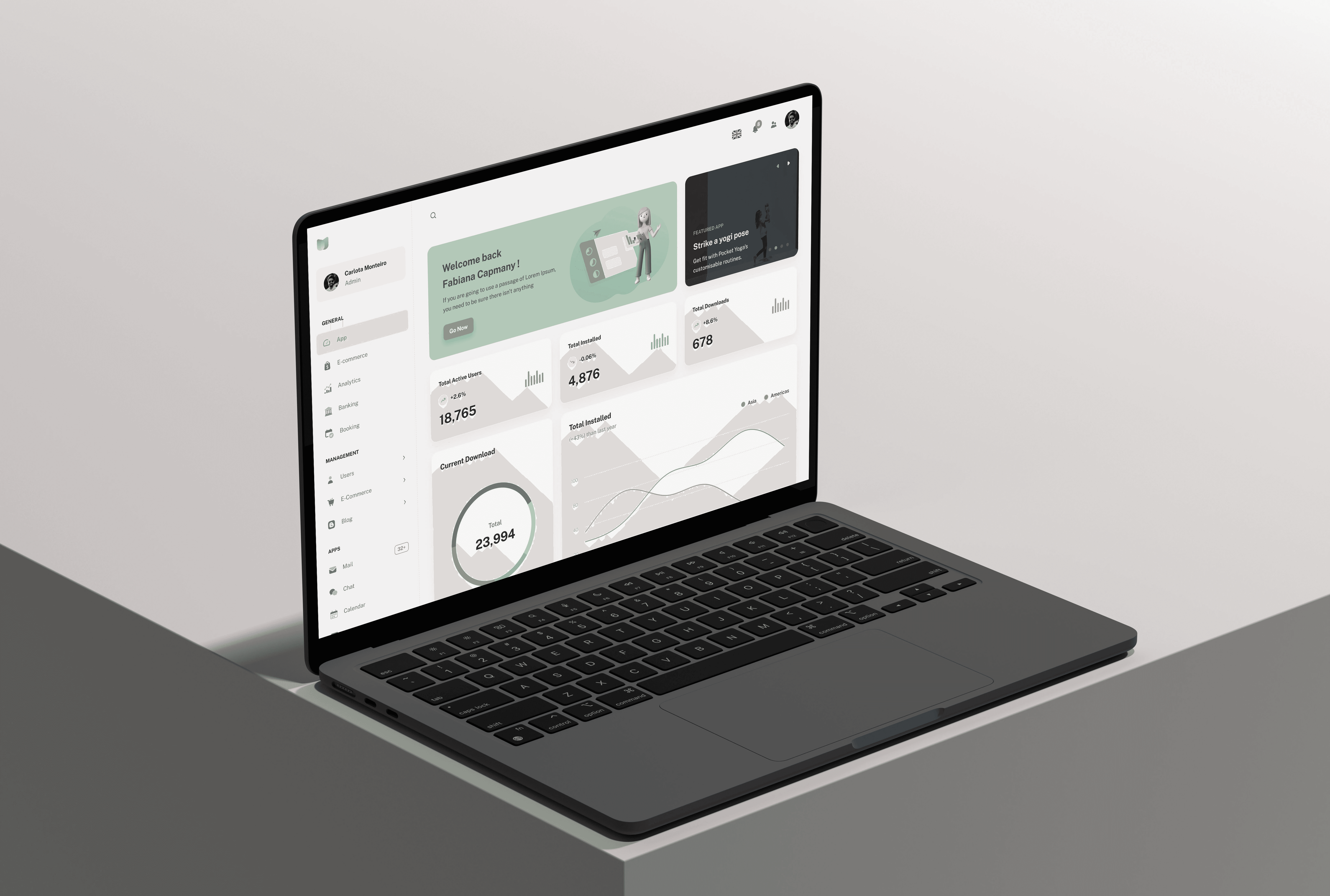
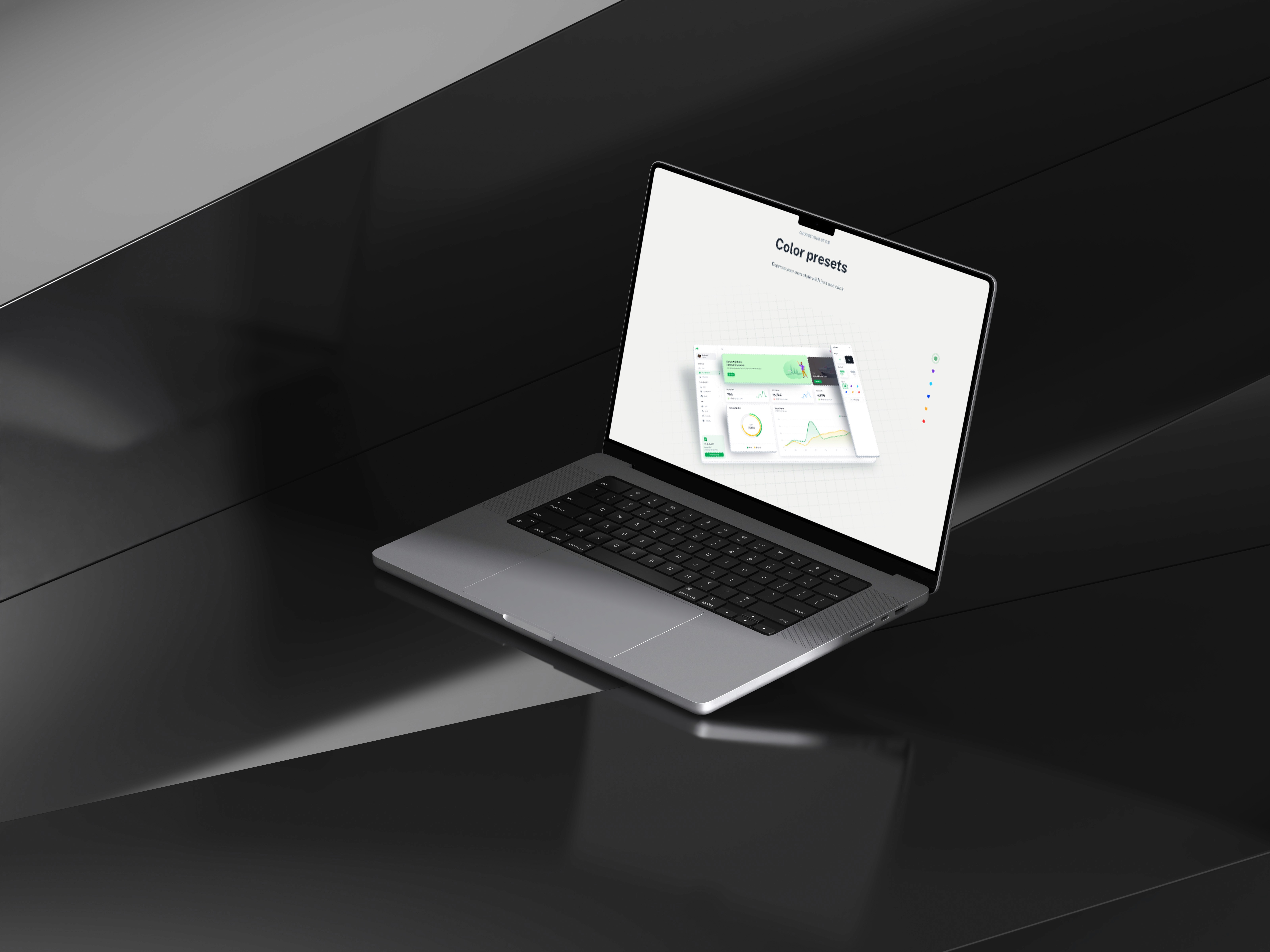
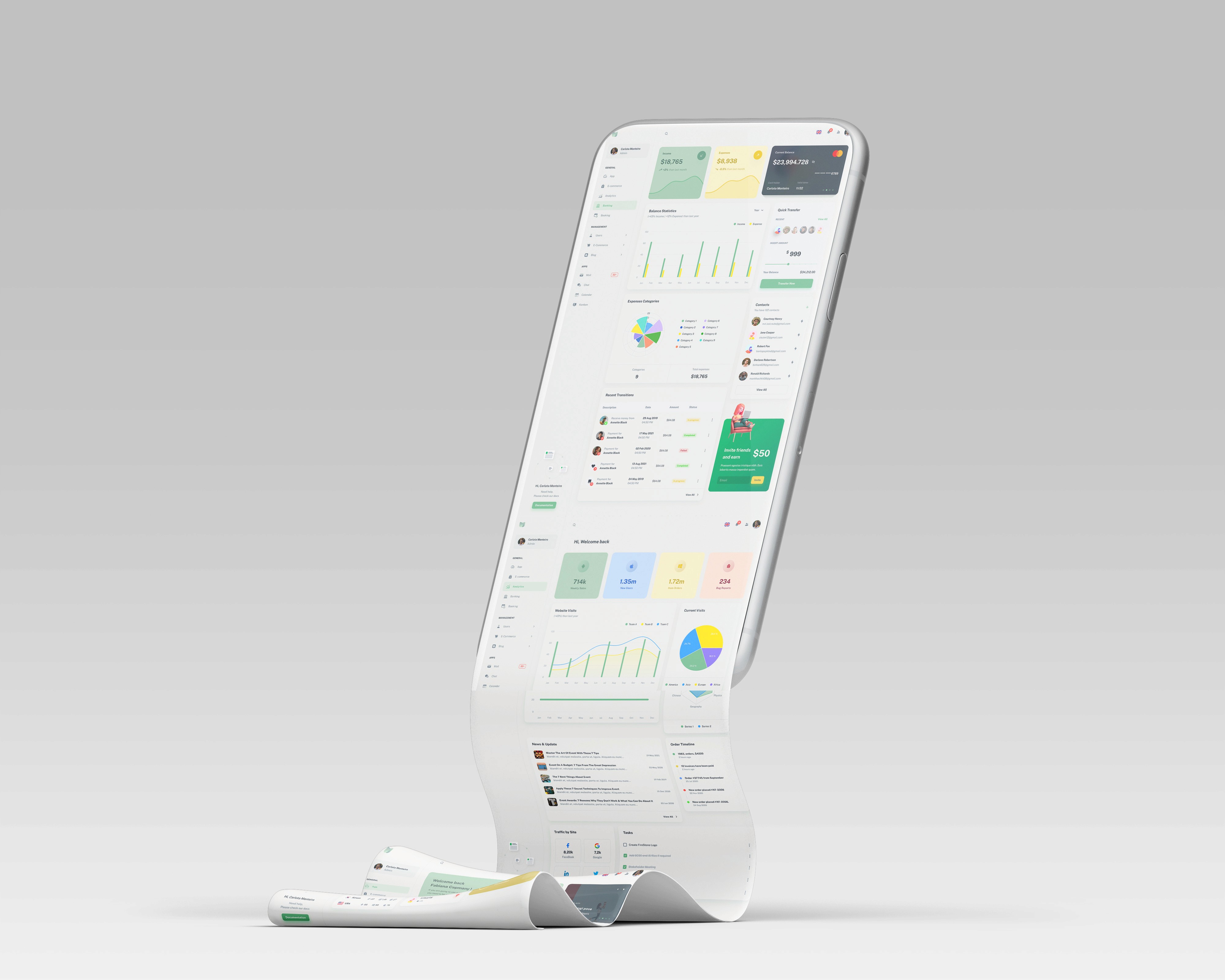
Solution
Flexibility
A library of customizable UI components, including buttons, dropdowns, and cards, was developed to provide adaptable design solutions. These elements allowed teams to rapidly tailor interfaces to specific needs while maintaining consistency.
Responsiveness
All components were designed to ensure seamless performance across devices and screen sizes. This approach guaranteed a consistent user experience, regardless of platform or resolution.
Accessibility
Key accessibility features, such as ARIA labels and keyboard navigation, were integrated to ensure inclusivity. By adhering to WCAG standards, the design system met the needs of diverse users, enhancing usability for all.
Implementation Support
An intuitive design system guide was created to enable teams to adopt and implement components efficiently. This documentation provided clear guidelines, fostering consistent application across projects and improving collaboration among teams.
Results
Improved Development Efficiency
The introduction of reusable components and well-structured documentation reduced development time by 30%, allowing teams to focus on delivering high-quality user experiences faster.
Enhanced Design Consistency
A cohesive design system ensured a uniform user experience across platforms, reinforcing brand identity and building trust with users.
Accessibility Compliance
By integrating accessibility features aligned with WCAG standards, the UI kit broadened inclusivity, making applications accessible to a wider audience.
Positive Developer Adoption
The UI kit was seamlessly integrated into developer workflows, with teams praising its ease of use, flexibility, and ability to meet diverse project needs.
Key features implemented
Scalable Typography System
Developed a responsive text style system with predefined settings for headings, subheadings, and body content, ensuring readability across devices and screen sizes.
Interactive Elements
Included pre-built states for hover, focus, and disabled interactions, improving usability and providing instant feedback to users.
Customizable Color Palette
Enabled teams to adapt themes while maintaining visual consistency and harmony, supporting branding requirements.
Core Elements
Colors: Comprehensive palette supporting light and dark modes.
Typography: Flexible and responsive text styles.
Shadows: Depth effects for enhanced visual hierarchy.
Grid: Structured layout system for alignment and spacing.
Icons: Scalable and consistent icon set.
Basic Components
Accordion, Alert, Autocomplete, Avatar, Badge, Breadcrumbs
Buttons, Checkbox, Chip
Data & Interaction Components
Data Grid, Date Pickers, Dialog, Drawer
List, Menu, Pagination, Popover, Progress
Radio Button, Rating, Slider, Stepper
Switch, Table, Tabs, Textfield, Timeline, Tooltip
Transfer List, Tree View
Extra Components
Carousel, Chart, Drag-and-Drop (Dnd), Editor
Form Validation, Form Wizard, Image Handling, Label
Layout Tools, Lightbox, Map Integration, Markdown Support
Mega Menu, Multi-language Support, Navigation Bar
Organization Chart, Scroll Effects, Scroll Progress Indicators
Snackbar, Upload Functionality, Utilities
Each feature and component was designed to be modular, scalable, and easy to implement, streamlining development workflows.
Impact
The UI Kit was successfully launched, empowering teams to create consistent, user-centered designs with greater efficiency. By implementing atomic design principles, the kit struck the right balance between flexibility and scalability, improving the design-to-development process. These enhancements not only streamlined workflows but also established a new standard for modular design systems, enabling teams to deliver high-quality, adaptable interfaces across platforms.
12.1k
4.9*
900+

While most of my client reviews are NDA-protected (because, you know, top-secret agency white label stuff), I managed to sneak in a few favorites from my previous partners.